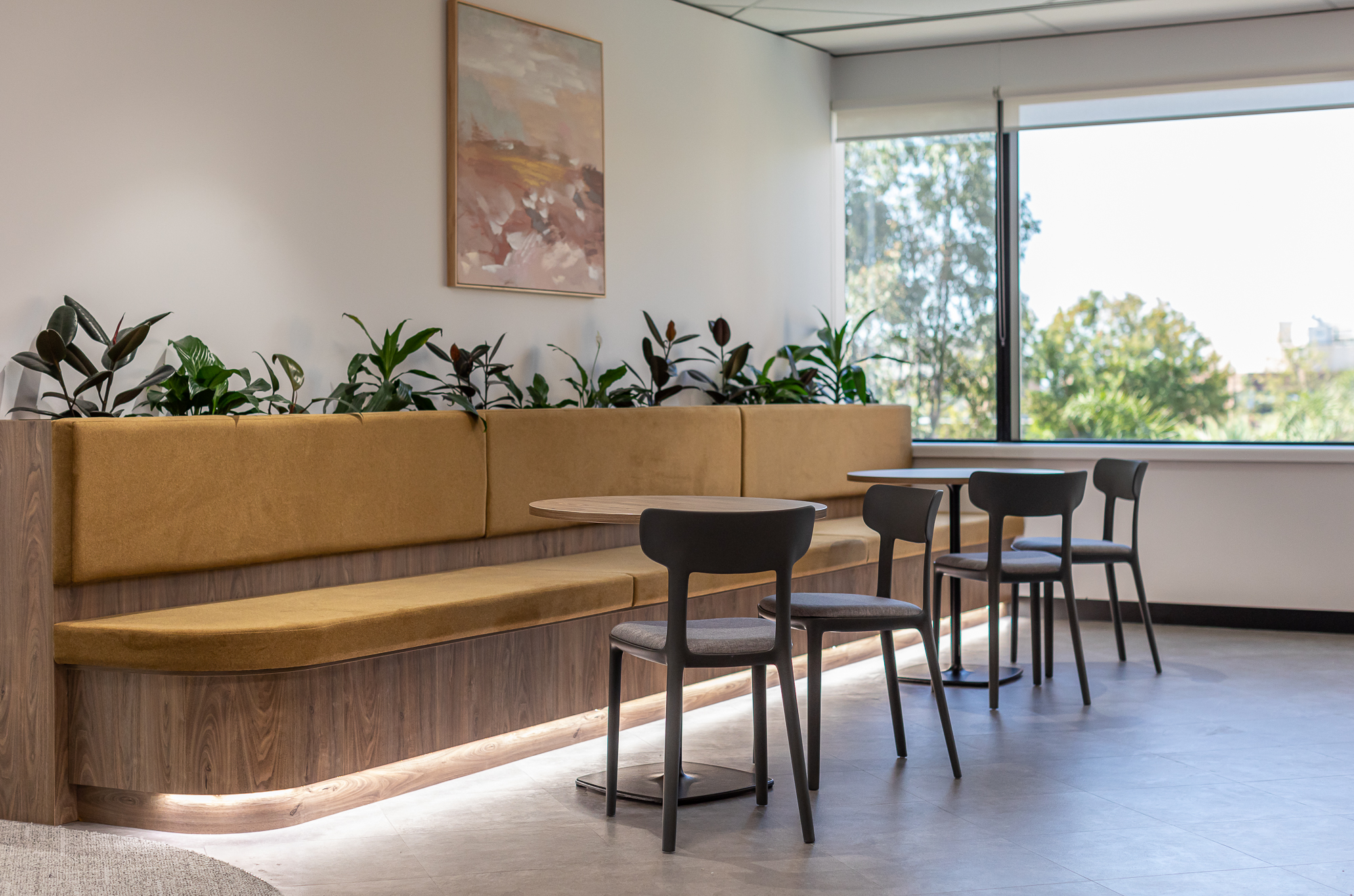
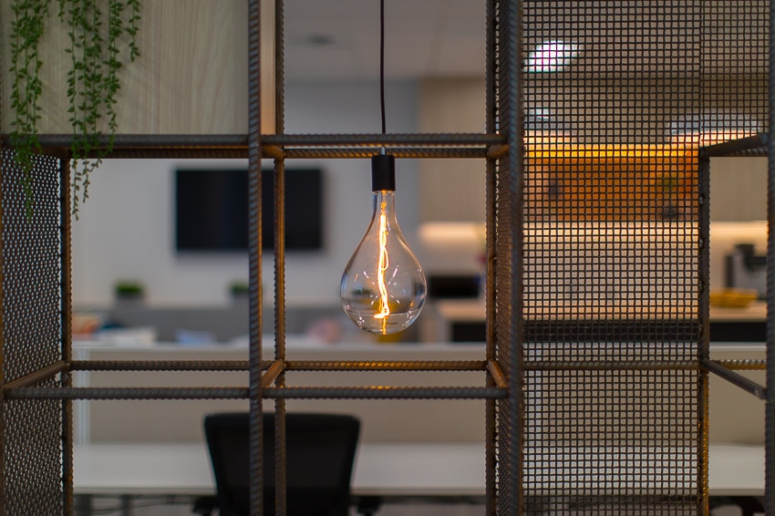
Adjacent to the world famous Kings Park this office fitout formed part of a larger scope building upgrade and the results are amazing! With all areas flooded with light this warm and inviting large office space encourages colaboration, movement and productivity for all. Colour and furniture choices bring an element of comfort and style into this workspace that tie well into the corporate image of our client in a subtle way.
HOW DID THE PROJECT RESPOND TO THE CLIENT BRIEF?
All parties involved collaborated closely to ensure that every aspect of the project aligned with the client's requests and vision. Through this partnership, a design was created that integrated contemporary aesthetics with numerous practical elements for the employees' daily operations.
HUB's approach was driven by the client's budget and timeline. By carefully sourcing materials and optimizing the construction process, HUB ensured that the project was delivered within the approved budget and the agreed timeframe. Efficient project management and clear communication were essential during the whole process.
To meet the client's business needs, HUB implemented a variety of features and elements reflecting the client's brand colours and identity. Glazing film was strategically applied to maximize natural light while preserving privacy. The spacious boardroom was designed with elegant finishes and furniture to comfortably accommodate 12 people. Meeting rooms were tailored to accommodate 6 to 8 people and were equipped with video equipment. Prioritizing ergonomics, the selection of open-plan workstations aimed to create a healthy and comfortable work environment.
Furthermore, a substantial breakout area and kitchen were designed for the staff, offering lots of seating and tables. This space was designed not only as a relaxation space but also as an event area, as per the client's request.
HOW HUB ACHIEVED EXCELLENCE...
HUB achieved excellence in the design outcome through a combination of strategic planning, creative problem-solving, and meticulous attention to detail. The key features and elements of the design and construction project were carefully orchestrated to create a cohesive, functional, and visually appealing space.
The layout was meticulously planned to ensure a logical flow and utilization of every square meter. By strategically placing the offices along the perimeter walls, and optimizing the arrangement of workstations, we encouraged organic interaction and teamwork. The arrangement of meeting rooms and the boardroom catered to privacy and accessibility, while the waiting area provided a welcoming entrance point.
Each element was selected not only for its aesthetic appeal but also for its durability and functionality and the client's brand identity was the guide for the selection of colour schemes and textures.


