Client involvement was a big deal in this project. We had to work closely together, meeting and talking multiple times. By keeping the communication flowing between the designer, suppliers, and the client, we not only met but even exceeded what the client hoped for. It turned out really well.
HOW DID THE PROJECT RESPOND TO THE CLIENT BRIEF?
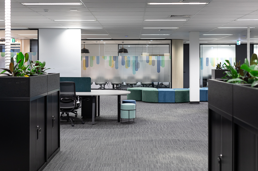
The project really nailed it when it came to what the client wanted. We made sure the Boardroom could comfortably fit 12 people, making it perfect for big meetings. Collaboration was a big deal, so we set up open-plan workstations, hot desks, and cool breakout spots for everyone to brainstorm and work together.
We didn't forget the smaller meetings either – we designed meeting rooms for 4 and 8 people. The offices were both practical and stylish, while the reception area was super inviting.
We made sure there was plenty of storage, utility space, and even a comms room to keep things organized. And a training room, which was all set up for whatever the client needed. Also, to keep things private but bright, we used customized privacy glazing film.
Overall, the project totally nailed what the client wanted, creating a workspace that's practical and awesome.
HOW HUB ACHIEVED EXCELLENCE...
Our approach to layout and element selection was guided by the principles of functionality and aesthetics. We considered traffic flow, accessibility, and the needs of different teams when determining the placement of workstations, meeting rooms, and breakout areas.
Material selection was driven by durability, ease of maintenance, and visual appeal. For example, we used durable materials for high-traffic areas like the kitchen and breakouts while opting for more elegant materials in the reception and boardroom.
To address the challenge of balancing privacy with openness, we used glazing film strategically. This allowed natural light to flood the workspace while maintaining necessary privacy in meeting rooms and private offices.


